Search This Blog

Tuesday, January 31, 2017

Commute by Bike

Get to Work!

Biking as a Solution to Commute Woes?

Bicycling is a healthy activity that should be encouraged.  We all want it to be a safe activity not least because many bicyclists are children.  But, does bike-to-work solve any problems related to Greenhouse Gas Emissions?

Link to this post: https://meetingthetwain.blogspot.com/2017/01/live-work-commute-3.html

Summary:

With the most optimistic assumptions, we can eliminate at most 1.3% of GHG emissions if we could get 10% of the US population to abandon cars completely.  More likely is about 0.5% reduction in GHGs by getting 10% to go to car-less commutes.  The reason is that of GHGs, only 26% is due to transportation.  Of that, only half is due to personal vehicles (the rest is trucks, planes, etc.).  Of those personal vehicles, only one quarter to one third of use is for commuting.  So 10% of 33% of 50% of 26% is 0.5% of GHG emissions reduced by biking to work.

That is for the wildly optimistic assumption of 10% of people commuting by bike.  Actually, the percentage of bike commuters is about 1% for the SF Bay Area and only 0.6% for the country as a whole.  That works out to between 0.05% to 0.15% of GHG reduction from those biking to work.

We also look at an experiment in the UK of a town specifically designed to enable more biking.  It did not work out as hoped for.

There are many excellent reasons to bike, or walk to work (health, mental reflection, appreciation of the environment) as described very well here:
https://cleantechnica.com/2017/01/30/benefits-of-walking-bicycling-transit-health-mind/

However, as a way to save on GHG emissions, walking/biking to work is not significant.

----------------------------------------------------------

Data:  In the SF Bay Area only a little over 1% bike to work   That number has gone up and down but stayed around 1% over the last few decades.  Sunnyvale is not significantly different.  Here is the census data (click on image to enlarge):

The top 5 cities in 2016 were Portland (6%+), then San Francisco, DC, Minneapolis, and Seattle all at around 4%:
https://bikeleague.org/content/bike-commute-growth-has-leveled-some-cities-still-show-way

Other states and cities in the US aren't much different (click on image to enlarge):
http://www.census.gov/prod/2014pubs/acs-25.pdf
As the above chart shows, the US averages 0.6% biking to work with only Oregon above 2%.  Major urban areas max out at 6% biking to work and 15% walk to work as shown in the table below.  Most are far below that (click on table to enlarge).

http://www.census.gov/prod/2014pubs/acs-25.pdf
For all the fans of Portland (which includes me) I have to add that the 6.1% biking to work (above) is only within Portland City boundaries (pop. 630,000).  The entire Portland metro area of 2.4M has 2.6% biking to work.  C.f.,

Nationwide, we use cars.  (click on image to enlarge)
http://www.census.gov/prod/2014pubs/acs-25.pdf
This has not changed significantly from 2008 to 2016
https://www.brookings.edu/blog/the-avenue/2017/10/03/americans-commuting-choices-5-major-takeaways-from-2016-census-data/

Vehicle ownership seems to have peaked in the last 15 years:


But Vehicle Miles Traveled (VMT - total and per capita) has resumed it's upward trend after declining slightly during the Great Recession.
https://www.ssti.us/2017/05/vmt-growth-continued-slowed-in-2016/

Commuting is between a quarter and a third of all personal car use.  Getting people out of their cars for commuting is not even close to adequate for serious GHG reduction.  We also need them biking to the store, when visiting friends, and for recreation.  This is possible in that it doesn't violate any laws of physics so let's assume that everyone who bikes to work also bikes to everything else, too. (click on image to enlarge)
https://www.fhwa.dot.gov/policy/2010cpr/chap1.cfm
The average speed of bicyclists is 10 mph.  Of commute distances, about 50% are within 10 miles of home (= about 1 hour each way) which is probably the outer limit for most people to commute by bicycle. (click on image to enlarge)
https://www.rita.dot.gov/bts/sites/rita.dot.gov.bts/files/publications/omnistats/volume_03_issue_04/pdf/entire.pdf

Europe...

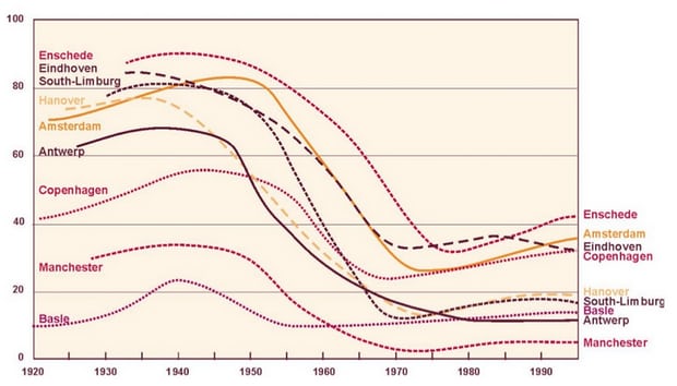
...is frequently mentioned as an example of how successful biking can be in terms of percentage of people biking.  The following graph shows that is in one sense true with some locations varying between 10% and 40% biking.  This deserves a further look.  (Click on graph below to enlarge)
Share of trips made by bicycle in Amsterdam plunged from 80% to 20% between 1950s and 70s.
https://www.theguardian.com/cities/2015/may/05/amsterdam-bicycle-capital-world-transport-cycling-kindermoord
The graph above is only counting share of trips made, not distance traveled.  When we look at distance we find little difference between European and American bike-friendly cities.  Portland, OR is likely the US's most bike-friendly city so we compare it to Rotterdam which is about the same size in population.  In both cities we find that most trips traveled by bike are under 3 miles long and max out at around 10 miles.  See graph below:
Rotterdammers go to 3-5 miles before taking a car

Portlanders go 2-3 miles before taking a car
Both graphs above from:
https://bikeportland.org/2014/10/21/five-surprises-comparison-portland-dutch-travel-choices-112468

We see that in both cities the max distance traveled by bike is around 3 to 6 miles.  Nothing wrong with that.  In the US that includes up to 29% of commuters as seen in a previous graph. (reproduced below):

VMT is calculated by multiplying the number of trips by the miles per trip.  That means that 10 drivers switching to bicycles for 3 mile trips cancels only 1 person driving 30 miles (i.e., 10 x 3 = 1 x 30).  We calculate that for the US Dept. of Transportation data above. Representing 29% of commuters by 29 vehicles, etc., and using the upper bound for miles commuted we get:
VMT = Vehicles * Miles
The above table shows in the last column VMT with everyone who commutes 5 miles or less bike to work - so that box is zero.  The last two rows show that if everyone within 5 miles of work commutes by bike it reduces VMT only 9%.  This is meaningless in terms of reducing Vehicle Miles Traveled (VMT).  It reduces local congestion but it is usually not the small side streets that are the problem, it is the major access highways.  In the case of Silicon Valley, it is not El Camino Real which is the problem (sometimes it is) but highways 237, 101, 280, and 85.  Biking does nothing to help them.

In chart form the table above looks like this:
Bars "1" = 0-5 mile commute, "2" = 6-10 miles, etc.
As the above table and chart show very clearly, VMT from the few people making the longer commute overwhelm VMT from the largest group making the shortest commute.

What if...

... cities were better designed to accommodate bikes?  That actually happened with disappointing results.  In 1949 in the UK, a new town Stevenage was planned out specifically to make biking as easy as possible by an urban planner who was a biking enthusiast.

The result was a total failure.

   "But to Claxton’s puzzlement and eventual horror, residents of Stevenage chose to drive – even for journeys of two miles or less. Stevenage’s 1949 master plan projected that 40% of the town’s residents would cycle each day, and just 16% would drive. The opposite happened. By 1964, cycle use was down to 13%; by 1972, it had dropped to 7%. (Today it has less than half that, and yet some neighbouring towns with few cycleways have cycling modal shares of 4-5%.)"
https://www.theguardian.com/cities/2017/sep/19/britains-1960s-cycling-revolution-flopped-stevenage

The problem seems to have been that it was just as convenient to use a car since the roadways weren't congested.  So people drove, even if it was less than 2 miles.  This implies that if the number of bicyclists increases enough to clear congestion people will switch back to cars until the congestion increases to the point where bikes are more convenient.  In other words, most people use bikes only if cars are less convenient.

Green House Gas Emissions


So what about Green House Gas emissions (GHGe)?  Transport (including ships, planes, freight trucks) is about 26% of total GHGe. (click on image to enlarge)

https://www.epa.gov/ghgemissions/sources-greenhouse-gas-emissions

Of the 26% of GHGs originating from transportation, light-duty vehicles (cars, SUVs, pickup trucks) are 63%.   (click on image to enlarge)
https://climate.dot.gov/about/transportations-role/overview.html
We have to allow that some of the light duty trucks are actually used for work so Joe the Plumber has to "commute" to work in his truck as he visits everyone with a clogged sink.  At most, maybe 50% of Transport GHGs are from people commuting by car but who might be able to bike or take buses.  If we got 10% of those people currently commuting by car to commute by bike, we'd be doing very well indeed (recall currently 0.6% of Americans bike to work).

Now the final calculation.  
  • Max bikers = 10% of personal vehicle GHGs
  • Personal vehicles cause 50% of transport GHGs
  • 10% of 50% = 5% of transport GHG emissions (if 10% abandon cars completely)
  • But, transport GHG emissions are only 26% of total US GHG emissions.  
  • So from bikes/walking replacing cars we have at most 5% of 26% = 1.3% of total GHG emissions.

1.3%...

... is the upper limit of how much GHGs would be eliminated by getting 10% of all commuters to abandon their cars completely for not only commuting, but also shopping, and recreation.  If abandoning cars applies only to commuting and they still use cars for other things, then it is at most a third of that 1.3% (about 0.5%) of GHGs would be eliminated by getting 10% of commuters to bike to work.

The final word:

Chevy Bolt - 100% electric - 238 Miles on a Charge - $25K after govt. incentives
Tesla Model 3 - 100% electric - 200+ Miles on a Charge - $25K after govt. incentives


Thursday, January 12, 2017

Sunnyvale's L.U.T.E.

The LUTE and Cars/Commutes


L.U.T.E. stands for Land Use and Transportation Element.  It is required by state law to be part of the general plan for each city.
A LUTE can be fun!
Sunnyvale's Draft LUTE is found here:
http://www.pmcworld.com/client/sunnyvale/documents/aug2016/1._Draft_LUTE.pdf

Of special interest on page 6:
"The LUTE land use plan represents a jobs/housing ratio of 1.73. This jobs/housing strategy maintains, or slightly lowers, the current jobs to housing ratio (1.75 in 2010) while continuing to allow for economic growth. The Land Use Diagram and LUTE policies support the development of up to 27,825 new jobs and 16,760 new housing units in Sunnyvale."

Questions:  How do we calculate the number of jobs added?  If by estimating sq. ft. per worker what if cos. lower the sq. ft. per employee?  How is this monitored?

Commuters TO Sunnyvale


An issue with this is that we already have a job surplus of 18,000 (84,000 jobs - 66,000 workers = 18,000 job surplus) and this is just going to add to that.  (See my blog on this issue here:
http://meetingthetwain.blogspot.com/2016/12/live-work-commute-1.html )

These 27,825 new jobs will be a 33% increase in jobs to 112,000.  Assuming the job surplus ratio stays the same we will have 24,000 more jobs than workers.  Not only that, but the number of people who live AND work in Sunnyvale is going down.  It is currently under 8,800 (2014) down from about 9,500 (2002). (cf, blog post referenced above).

If we assume zero growth in Sunnyvale residents working in Sunnyvale (in contrast to the actual decline we observed - so this is the optimistic view), then we will have nearly 28,000 additional commuters into Sunnyvale every morning.  Highway 237 and 101 seem somewhat packed at the moment as does CalTrain so it is hard to see how workers will get in and out of Sunnyvale.  BART is very clear they are going to stop at Santa Clara's CalTrain station (if they get that far).  No appreciable light rail coming into Sunnyvale in the foreseeable future.  How does this work?

Commuters FROM Sunnyvale


In addition to the increased number of commuters, we will have an increased number of residents thanks to the 16,760 new housing units.  At two persons per housing unit, that is about 33,000 people added to the existing population of 150,000 for a total of 183,000 a 30% increase in population.  At 3 persons, it is about 50,000 more residents for a total of 200,000 for a 33% increase.

As shown in my blog post on commuting, we have seen that the additional workers added to Sunnyvale for the last 12 years only add to the number of commuters to other cities so we can assume somewhere around 15,000 to 30,000 more people commuting OUT of Sunnyvale.

Questions:  How do additional commuters (in and out) manage to commute?  Will Mathilda become a double-decker freeway?  Extend Mary Ave. over 280?  Widen 237?
(ref: http://meetingthetwain.blogspot.com/2016/12/live-work-commute-1.html )

What will be the effect on housing prices and rentals since increased density increases rents and housing costs?  (c.f., http://meetingthetwain.blogspot.com/2017/01/live-work-commute-2.html )

Cars

Lower Speed Limits ------------

Policy 35 on page 29, under the topic of Transportation Networks talks about lowering speed limits.

I gather the goal here is to make Sunnyvale more amenable to biking and walking.  But there are limits to how much people bike and walk of around 3%-6% and 10%-15% respectively.  Ref:
http://meetingthetwain.blogspot.com/2017/01/live-work-commute-3.html

Questions:  What is the desired outcome in terms of %-age of people walking and biking?

Questions:   If we are adding more commuters in and out don't we want to increase the commute throughput?  Which streets are intended to have their speeds reduced?

Parking Fees for Street Parking in Neighborhoods -------------

Policy 31 on page 29
Questions:  What is the desired outcome from this?  Is there an expected reduction in car use?  If so how much.  What other cities our size do this?  If someone has people over for dinner how much do you anticipate they will have to pay to park for 2 hours in front of their house?  If someone's adult kids visit for a week, how much will they have to pay?

Parking Fees for Shopping, Dining Out, Movies, etc. ----------------

Still on page 29:
Questions:  Is there any possibility people will refuse to go to businesses where parking fees are required and instead go to places where there is free parking?  Will this hurt Sunnyvale businesses competing with neighboring communities?  Any measure from other communities of the effectiveness of this in reducing vehicle use?

Making Cars More Costly ------------------------

Still on page 29:

Questions:  What true costs are we talking about?  What does "improve the cost return attributable to driving" mean?  Are we also going to make more visible the "true costs" of public transit as well?  Currently, VTA fare recovery is about 12% so for every $2 bus ride, an additional $14 govt. subsidy is required.

Housing

From page 44 of draft LUTE:  "POLICY 62: Encourage the development of housing options with the goal that the majority of housing is owner-occupied."

Question: Does this mean more condos and fewer apartments?


Commuting:

https://www.census.gov/hhes/commuting/files/2014/acs-32.pdf
The percent of people commuting by auto has risen to and leveled off at about 85% over the last few decades:
https://www.census.gov/hhes/commuting/files/2014/acs-32.pdf

At most 8% bike to work:

https://www.census.gov/hhes/commuting/files/2014/acs-32.pdf
Most people actually enjoy commuting and others don't mind it.  In one survey, only about 25% actually disliked commuting.

http://www.theatlantic.com/business/archive/2016/03/a-mystery-the-people-who-enjoy-commuting/474138/

On average it is about 60% of Americans enjoy commuting.  Even among those who work in big cities, 47% actually enjoy their commute.  Getting them out of their cars will be a challenge.  Is it even realistic to try?  People have been preaching against sin for some time now and yet some people still sin  (or so I'm told).  One school of thought says that any plan requiring a change in human behavior is doomed to failure.  On the off chance they are right, what other avenues should be looked at? (click image to enlarge).
http://abcnews.go.com/Technology/Traffic/story?id=485098&page=1


Wednesday, January 11, 2017

Home Energy Use 1


Heat Pumps for Residential Use


For the US as a whole, electricity is responsible for 43% of residential GHG emissions.  Natural gas for space heating and hot water heating is responsible for 46% of residential GHG emissions nationwide.  The remaining 11% is home heating oil, wood, & kerosene.  In California, where heating oil is seldom used, space heating and hot water heating are mostly gas comprising 52% of home energy use (click on chart to enlarge).

Space Heating + Water Heating = 52% of CA Home Energy Use
https://www.eia.gov/consumption/residential/reports/2009/state_briefs/
This represents about one third (33%) of annual home energy costs as seen in the next chart (click to enlarge):
 https://www.eia.gov/consumption/residential/reports/2009/state_briefs/
It is fairly easy to eliminate the use of natural gas for these applications with electrically powered heat pumps, hot water heat pumps, and/or "tankless" hot water heaters.  If the source of the electricity is clean energy (like solar panels) then you have eliminated over 50% of residential GHGs.

"Comparative Energy Use of Residential Gas Furnaces and Electric Heat Pumps"
http://aceee.org/comparative-energy-use-residential-furnaces-and

Below is a hybrid heat pump hot water heater in the Lowe's catalog.  The "hybrid" refers to the fact that when the outside air is really cold (below 40) an electric heating element will kick in.  Otherwise it uses the much more efficient electric heat pump.


The advantage of heat pumps is not only GHG reduction and the elimination of natural gas, (and of 'fracking') but a considerable cost savings as well as seen in the following chart (click chart to enlarge):
https://asm-air.com/hvac/heat-pump-vs-furnace-pros-cons/
The annual heating costs of a Geothermal Heat Pump are only 32% that of a common natural gas furnace and even less costly than most other forms of heating.

How They Work

Heat pumps are present in most homes.  They are called refrigerators and air conditioners!  What they are doing is pumping the heat from the inside of an enclosure - refrigerator or room - to the outside.  Typically there is a little vent in the bottom or rear of a refrigerator that blows warm air out.  A room air conditioner also has to have a heat exhaust to the outside as it moves the heat from the inside.

"Heat pump water heaters use electricity to move heat from one place to another instead of generating heat directly. Therefore, they can be two to three times more energy efficient than conventional electric resistance water heaters. To move the heat, heat pumps work like a refrigerator in reverse."
From: https://energy.gov/energysaver/heat-pump-water-heaters

Here is a diagram of a hot water heat pump (click to enlarge):
http://www.stiebel-eltron-usa.com/products/accelera-heat-pump-water-heaters
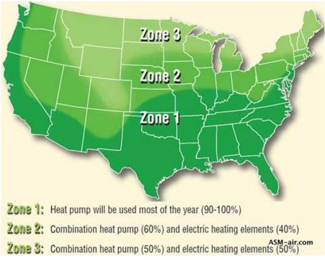
Heat pumps work differently in different climates as the following map shows :
Same Stiebel link as above
More resources:

How it works even in Vermont:
http://www.homepower.com/articles/solar-water-heating/domestic-hot-water/heat-pump-water-heaters/page/0/2

State of VT on heat pump hot water heaters (click to enlarge):
https://www.efficiencyvermont.com/products-technologies/heating-cooling-ventilation/water-heating
Nice infographic from US Government:
https://energy.gov/articles/new-infographic-and-projects-keep-your-energy-bills-out-hot-water

More explanation:
https://energy.gov/energysaver/tankless-coil-and-indirect-water-heaters

InfoGraphics for 16 selected states on energy use
https://www.eia.gov/consumption/residential/reports/2009/state_briefs/

Tankless vs Heat Pump hot water heaters.
https://cleantechnica.com/2017/01/12/dragons-guide-100-renewable-home-part-2-water-heating/

Tuesday, January 3, 2017

Live Work Commute 2

Housing Costs and Density


Executive Summary:


The problem of rising rents has many people arguing for building many more apartments in order to lower rents.  They are thinking "the law of supply and demand" (LoSaD) says supply will increase indefinitely until everyone can afford the product.

That isn't what the LoSaD says, but in any case it is not relevant because the supply in the case of housing is land and they stopped making it.  As demand increases for a limited supply of land, the price will increase as long as there is anyone anywhere that can pay the price.  We show this with data and economics.

Key points:
  1. Econ 101's "Price Theory" - Law of Supply and Demand - is true for some things such as manufactured goods, commodities (like wood and grain), and for land but it is not true for housing because...
  2. ...Real estate involves a fixed amount of land within city boundaries.  Increasing demand for this land will not increase the supply, so the price must rise with demand.
  3. Construction costs for different densities are greater per square foot as the height and density increases past a certain point.
  4. People pay more to lessen their commute time.  Therefore centers of cities will cost more because living there makes commuting easier.
  5. The value of the land is determined by the income it will generate.  Higher density housing means each acre of land generates more rent.  This increases the value of the land and drives up the rental income required to generate a profit.
Separately, there is a set of falsehoods referred to as "Econ 101-ism".  I address it elsewhere:
http://meetingthetwain.blogspot.com/2017/01/econ-101-ism.html

In sum - Increased density means increased housing costs.  Therefore, adding housing to a dense city makes it more expensive.  This has been known and seen to be true everywhere since the 1800's.  Here's the academic way of saying it:

"Population Density is Higher near the City Center (where housing costs are high) than at the city outskirts (where housing costs are low)."

"...density as well as the land rent fall as the distance to the city center rises. This provides an explanation for the fairly general empirical fact that the population density is higher near the city center (where housing costs are high) than at the city outskirts (where housing costs are low). In addition, the size of the residential area depends on the opportunity cost of land but also on the number of consumerstheir income, and the value of their commuting costs to the CBD (Central Business District).
(From: "Economics of Agglomeration" by Dr. Fujita, & Dr. Thisse, page 83)


1.  Basic Supply Demand Curves - AKA "Price Theory"


The classic supply-demand graph.  If you think you understand "increased supply lowers price" you can skip this but note that it doesn't apply to real estate.

People are referring to the following graph and theory when they say "...basic Econ 101" (click graph to enlarge).

The blue "Supply" curve is how many "widgets" suppliers will make for a given price.

It is saying that as the price increases (on the vertical axis), makers of the product will be motivated to increase the quantity (horizontal axis = supply) since they can get more money by producing more.  Moving to the right up along the blue line implies the price keeps increasing.  This price increase  induces ever more supply.

The red "Demand" curve  is how many "widgets" consumers will buy for a given price.

It says that if the quantity available is very small for the fixed demand then the price will be quite high.  As the quantity increases the implicit bidding for goods will result in a lower price for each of the more plentiful goods.  At the far left, the high unmet demand causes people to bid prices higher.  At the far right, there is not enough demand (or too many products) so products will go unsold if the price is not lowered to that point.

The Equilibrium point (P*, Q*) is where the price bid by consumers = the ask price by suppliers.

This Price P* and Quantity Q* where supply meets demand is called the "clearing price".  If supply increases past the equilibrium point, demand by buyers is insufficient resulting in a lower price and an "over-supply".  Then goods are left unsold - shelves don't "clear".


2.  The Supply-Demand Graph Succeeds...

...when it is based on a model of manufacturing.  We'll call the manufactured product "widgets".  Assume there are fixed costs of $1 Million per year to build and maintain a factory.

Widget Factory - Costs $1 Million
Assume "fixed cost" $1 Million to build & maintain a widget factory
Further assume that each widget costs $100 in labor and materials.

Labor and Materials - $100 per Widget
Assume labor & material "variable cost" $100 for each widget
Building only 10 "widgets" per year means that each widget must sell for $100,100 to pay for the $1M fixed costs and the $100 for the (variable) costs of labor and material for the 10 widgets produced that year.  See table below:


But, suppose the factory makes 1,000 widgets in a year - line 2 in table above.  Then labor and material (variable) costs for those 1,000 widgets = $100,000.  Add the $1 Million (fixed) costs for the factory and you have a total cost of $1,100,000 for the 1,000 widgets.  That works out to $1,100 per widget - much cheaper than the cost per widget of $100,100 for making only ten widgets.

If we make even more widgets, say 100,000, we get line 3 in the above table and our unit cost per widget is now only $110.  And so on...

This is what people are thinking of when they say increased supply lowers costs.


The problem is this doesn't work for housing because land costs vary and construction costs vary.  There is no "factory" of fixed costs, so the more housing units you make the more expensive it gets.  Double the number of housing units and everything doubles - the cost of land, the cost of materials, the cost of labor - so the cost per unit of housing stays the same or even increases - building higher can cost a LOT more per square foot.


3.  The Supply-Demand Graph Fails..


...in items like land.  In the case of real estate, the amount of land in a city is fixed so if demand increases, the price of the land increases but not the quantity.  Now the Demand curve is a vertical line.  See below:

In the above graph, it doesn't matter what the demand is, the quantity of land is fixed.  Increasing demand moves you up the line to a higher price.  Decreasing demand moves you down the red line to a lower price.  If you build more offices or housing you increase the demand for land and the price goes up because the quantity of land can't change.  That is one reason increased density increases housing prices.


4.  Construction Costs Increase with Height


The basic supply-demand graph fails in another way in building apartments and condos.  The basic supply-demand curve seen earlier only works if doubling the quantity doubles the cost of making the product - if 20 "widgets" cost twice as much to make as 10 "widgets".   The fixed costs of factory are then spread over more "widgets" = lower fixed costs per widget.  This is not true in building apartments when increasing above a certain height.

It is relatively cheap to build a 4-unit 2-story apartment with off-street parking behind the building.  Wood frame, simple labor.

Cheap Apartments - Wood Frame - Simple Labor
As cheap to build as possible
Going to 5-story apartments with ground-level parking underneath the living units costs more per square foot since you need a steel and concrete core and base.  An 8-story costs more per square foot to build than a 5-story apartment.  This is because you have to use more highly skilled labor, bring in cranes and heavy earth-moving equipment, install elevators, use more expensive material like concrete and steel, replace cheap off-street parking with expensive multi-level steel and concrete underground parking, and various other things.  

We can see this in the screen capture below from Zillow.  Two apartment buildings in the same city, one 4-story, one 8-story.  The 8-story apartment charges 64% more for a 2-bedroom apartment.  The higher priced one is a bit closer to downtown and so has to build higher to spread the higher cost of land over more apartments.  The more expensive apartment is also larger, but costs more per square foot.  That it costs more, not less is the key point.


Costs and therefore prices actually increase with housing density but in a step-wise or 'lumpy' fashion.  The blog "Market Urbanism" explains it well:

"Housing supply is “lumpy” because of these abrupt changes in construction costs as the market moves from one type of housing to the next. Because it is much more expensive, on a per square foot basis, to build mid-rise housing than single-family housing, and much more expensive to build high-rise housing than mid-rise housing, the supply curve for housing within a neighborhood looks something like the stair-stepped red line:

"(Note that not even vulgar Econ 101 predicts that housing prices will drop after a switch to a more expensive technology. The switch merely prevents prices from continuing to rise because new supply can continue to be added at the same cost.)"
http://marketurbanism.com/2016/09/28/econ-101-and-the-missing-middle/

Going from 2-story cheap wood frame housing to 4-story housing, or from 4-story housing to 8-story housing will not happen until rents climb high enough to justify the increase in costs for the increase in cost per square foot.  Higher density increases building costs because of increased construction costs per square foot.  This added construction cost is in addition to the increase in land costs due to higher demand.


5.  High Density Costs More


We see below a curve of price vs. distance from high density urban centers.  The greater demand for land in a high density urban environment results in higher costs for that land as competing buyers bid up the price of land.  The theoretical curve for this is shown below (click on graph to enlarge):
The above is from a paper (2015) "SPATIAL DISTRIBUTION OF LAND PRICES & DENSITIES - The Models Developed by Economists" by Alain Bertaud at the Marron Institute of Urban Management at NYU.  He previously held the position of principal urban planner at the World Bank. His paper is available at:
http://marroninstitute.nyu.edu/content/working-papers/the-spatial-distribution-of-land-prices-and-densities

The above theoretical econometric profile of land prices assumes an urban core with a single industry to which people commute from the surrounding area.  The surrounding area is assumed to be flat and easily developed for housing at any distance.  This sounds a bit simplistic but we see that it closely matches reality looking at actual distributions in the next chart (click on graph to enlarge):

About this graph, Mr. Bertraud writes "...an increase in population, everything else being equal, would increase both land prices and densities."  The bidding for the purchase of land that goes on - implicit or otherwise - is part of the supply-demand vertical line graph shown earlier and raises land prices as density increases.  This will show in that prices per square foot increase for comparable living units near the core and further away from the core.  Smaller living units at the same price as the suburbs or much higher prices for the same-sized units in the Central Business District.

Note that in the first graph the vertical axis is price and in the second the vertical axis is density.  That is because they are equivalent.

This applies to most cities reasonably well as seen here (click on graph to enlarge):


It looks like LA and Atlanta violate the rule.  They don't.  It just looks that way because the density per sq. mile in the Central Business District is much lower in LA, NYC, and Atlanta compared to say Bangkok.  Using the same numbers on the vertical axis for LA and Beijing makes LA look flat but it is all relative.


5.  People Pay More to Be Closer to Work


Commuting takes time.  Someone earning $50/hour while commuting 1 hour per day, 20 days a month is "paying" $1,000 per month in time lost to commute.  They should be willing to pay $1,000 per month more in rent to be closer to work (assuming they have that money).  Apartment owners in the center city capture that extra commute cost by charging higher rents for lessened commutes.  Or looked at another way, the implicit bidding in real estate transactions bids up the price.  Regardless of your perspective,  this explains part of the higher cost of center cities.

Here are some real world examples of commute times vs. price from the Financial Times.  They show that as the length of commute time (horizontal axis) decreases, rents (vertical axis) increase.  People are willing to pay more money to spend less time commuting and more time for themselves.  (click on charts to enlarge):


Graphs from:

Same thing only different:


Commute times are typically a bit over 30 minutes each way = 1 hour or more total every day.  Longer commutes typically are on public transit.  People are willing to spend more time commuting if they can read a paper or chat with a friend - see below (click graph to enlarge):

The three worst commutes in the US are in the NYC metro area.


This increased value in being close to a commute line is explicitly described in a recent NY Times article about the completion of a new subway line providing subway access where there was none before.  The principal fear by residents near the new subway entrance is that rents will rise so high they will be priced out of the city.  People pay more to lessen their commute time driving out those who can't keep up in the bidding war.

“Displacement is a real concern,” said Thomas K. Wright, the president of the Regional Plan Association, an urban policy group. “When you increase the values in areas like this, you need to do things to protect affordable housing and retail.”


http://www.nytimes.com/2016/12/30/nyregion/second-avenue-subway-rent-worries.html


6.  Higher Density = More Rental Income = Higher Land Costs


The price of the land is dependent on the income derivable from it.  Land with potential to produce $20,000/month income is worth twice as much as land producing $10,000/month income.  This is one of the most important ways to value that land which can produce rents and is more fully discussed here: https://en.wikipedia.org/wiki/Income_approach

Land that can feed only 5 sheep is worth half as much as land that can feed 10 sheep
Land that can feed 10 sheep is worth twice as much as land that can feed only 5 sheep
If land is rezoned for higher density it will be able to realize a higher rental income because more apartments will generate more rents.  The land will cost more immediately after the rezoning. The high rise apartments built on it will cost more because they have to pay for the higher land cost.  The fact that more apartments can be built does not translate into lower cost per apartment. The supposed economy of scale that "Econ-101-ists" expect is negated by the higher cost of the land due to that increased density.

This is again where the basic "Econ 101" model breaks down.  There is no way to get the economies of scale that arise in the "widget" factory.  This is because the fixed cost of the factory in that model is not matched by a fixed cost of land for housing.  The cost of land for housing is highly variable. The cost of land depends on the number of apartments and demand for those apartments (schools, commutes, income levels).  On the other hand, factory costs are relatively stable regardless of the number of 'widgets' produced or the demand for those 'widgets'.

Compare the rents for two average priced 1-bedroom apartments - one in Manhattan, and the other in suburban Nassau County, Long Island.  $3200 for a 1 bedroom in Manhattan vs. $1400 for an average apartment in Nassau as seen below:

Manhattan prices 2016
Below is the house hold data for suburban Nassau County on Long Island, just outside NYC.
Suburban Nassau County, NY rents 2016
http://www.city-data.com/county/Nassau_County-NY.html

Here is an average 1 bedroom apartment for $3,200/month in Manhattan.


Here is an average 1 bedroom apartment in suburban Long Island (Nassau County) costing between $1500 and $1700 per month (half as much):


Neither of the two apartments are particularly luxurious, but to afford the Manhattan apt. at 33% of income you need $10,000/month = $120,000 per year income.  For the Nassau County apartment you need $4500/month or $54,000 per year income, if rent takes 33% of income.  People without sufficient income "pay" for the apartment in terms of commute time since they don't have the extra dollars for higher rent.

What can happen to lower rents a little is that a slew of new apartments come on-line all at once. This may result in a temporary over-supply.  Some older apartments will then back off some of the rent increases from the early boom years.before the new apartments were finished.   The newer apartments will not lower rents, though they may offer free gym memberships or two months free rent to new renters.

This may now be happening in NYC and after a few months delay in San Francisco as well.  There seems to be a small but noticeable affect on rents.  (That small decline may also be seasonal since in Winter, when the screen shots were taken, is not a popular time to change apartments.)  But this small rent decrease comes after huge increases which spurred the building.  A 100% increase followed by 5% decrease doesn't mean rents become more "affordable".  More on this in another post.

Conclusion:


The net effect of increased density is increased rents.
  1. As density increases land becomes ever more valuable resulting in ever higher costs per acre of land.
  2. The higher cost for land implies greater height for apartment/condo buildings to pay for the costlier land.  An apartment building with more stories costs more than lower height apartments.
  3. Attempting to lower the land cost per apartment by increasing height/density increases the rent per acre which makes the land even more costly and raising the rent required.
  4. This continues on and on in an upward spiral of ever increasing costs resulting in the high cost of housing in New York City.

Someone suggested I add a solution to this problem.  I was surprised because I didn't know it was a problem.  Presumably people who live in Manhattan like living there and are willing to pay the high rents.  People who live in Paterson, NJ and commute to NYC are presumably happy with the commute.  If they didn't like their situation they could move to some place cheaper (and many do) so where's the problem?  There are, of course, trade offs which need to be articulated, and understood.  Higher density will raise rents and those currently in low cost housing will have to be accommodated for.

(Addendum 1/6/2017:  It may appear there is over-emphasis on the additional cost of building higher.  The dominant factor is demand for land.  Even if buildings were super cheap, new buildings would charge higher rent because they can - "new" commands a premium.  And they won't build at all if rents start to decline - what for?  Rents can go down - look at Detroit: economic collapse and grotesque corruption & mismanagement will lower rents.)

There is much more to say on this but it is already too long, and I have covered the basics.

This is Part 1 on the subject.
Part 2 is here: http://meetingthetwain.blogspot.com/2017/02/is-there-housing-crisis.html
Part 3 is here: https://meetingthetwain.blogspot.com/2017/01/live-work-commute-2.html

For now, this is ...