Commute Times
Countries, Metro Areas, Cities
 |
| Let's Commute!!
In looking at commute times around the world and particularly in the US, we find that most people try to arrange their lives so that the time to get to work is on average about 30 minutes.
|
Summary:
This is part two of a series on commuting. This part focuses on commute times. Part one looks at commute distances. Link to this post is: https://meetingthetwain.blogspot.com/2018/07/commute-times.html
http://meetingthetwain.blogspot.com/2018/06/commute-distance-in-us-metro-areas.html
Regardless of the transport mix or availability, the average time for each metro area in the US is very close to 30 minutes. It is a little longer in other countries because more people there use public transit which is slower than driving.
Second-by-Second Timing of Commute Times
NYC vs San Francisco

There is no point in broadly trying to shorten commute times because people everywhere adjust their lives so that commute times stay the same.
Discussion:
Everyone thinks their area has the worst commute times but in fact, most countries have longer commute times than the US as seen below (click image to enlarge):
Chart 1 - Commute Times in OECD Countries
OECD = Rich Countries
We see in the following chart for the EU Capital Cities distinct differences with the US. Far greater percentages use public transit, bike or walk to get to work. In 15 EU cities 50% or more use public transit to get to work. Contrast this with the NY Metro Area where around 65% commute by car. In the US, only 5% use public transit.
Very few developed countries except the US were ever self-sufficient in oil. Importing oil has a negative impact on their economy. As a consequence, most European and Asian governments impose very high taxes on oil to lessen imports and consequent loss of foreign exchange. With gas costing about $6 to $7 per gallon, commuting by car is far more costly in Europe than in the US. The high gas taxes subsidize public transit. |
From OECD's "How's Life - Examining Well Being" 2011 edition
Red Box around USA and line at 30 minute mark.
Green Box around OECD and line at 38 minute mark.
|
In the above bar chart the average commute time for all the OECD Countries (developed economies) is just under 38 minutes (green boxed bar in the graph above). This is probably because most other countries have better public transit than the US. In dense older cities like Paris and London that developed before autos were common, public transit is the only viable way to get to work for many people. Public transit is slower than automobile and lengthens the average commute time.
 |
| London Bus |
In 17 of the major EU cities below, over 25% walk to work. In the US as a whole, only about 3% walk to work. The maximum combined walk/bike percentage in US cities is 17% in Boston and Washington, DC. http://time.com/money/4244782/top-cities-walking-biking-to-work-2016/
(Click on chart to enlarge).
Distribution of Commute Modes
European Capital Cities
European Capital Cities
 |
| http://ec.europa.eu/eurostat/statistics-explained/index.php/Statistics_on_European_cities |
Commuting in the US
From the US Census' American Community Survey we know that the average commute time in US is 26 minutes. Here are the 20 longest commutes in US cities. These average closer to 30 minutes. California cities are 'boxed'. (Click on chart to enlarge).
20 Cities With Longest Commute Times
 |
| Red boxes = Northern California, Blue boxes = Southern California Average Commute time in US = 26 minutes Majority use Transit in NYC, Jersey City, and Washington, DC http://www.businessinsider.com/american-cities-with-longest-commutes-2017-10 |
- The commute times are almost all around 30 minutes. Something called "Marchetti's Constant" says just this - that people will arrange their lives so that on average they will commute around 30 minutes. https://en.wikipedia.org/wiki/Marchetti%27s_constant
- Note that the top three longest commutes are all in the NY Metro area. The two longest commutes are the areas where most people use public transit. The commutes take more time because public transit is slow. Buses average about 12 mile per hour vs the average metro area commute driving speed of about 36 miles per hour. The average commutes are a little above the 30 minutes in other cities where most people drive - Marchetti's Constant again.
- Nine out of the top twenty long commute times are in California - 4 in the San Francisco Bay area, 4 in the LA area, and 1 in the San Diego Area.
US Major Metro Areas
The specific cities in the earlier chart on commute times are a small percentage of their respective metro areas. Now we look at entire metro areas. I (mostly) used the same 26 large and fast growing metro areas for commute time that I looked at for part 1 on commute distance (with a very few exceptions). That represents 44 million workers and 100 million residents.
Commute Times in 26 Largest Metro Areas
LA and SF Commute Times are the Same
28 Minutes by Car, 49 Minutes by Transit
28 Minutes by Car, 49 Minutes by Transit
 |
| Average Commute Times for 26 US Census Metro Areas by 3 Modes of Transit Data taken from Governing.Com which derived data from the US Census Bureau. CA cities are boxed and their data points are yellow http://www.governing.com/gov-data/transportation-infrastructure/commute-time-averages-drive-public-transportation-bus-rail-by-metro-area.html |
Above chart of 26 metro areas shows:
- The average commute times are almost all under 30 minutes by car and just under 50 minutes by public transit. Since most people drive alone, the relatively few that take public transit raise the average to approximately 30 minutes.
- The average time by bus is just under 50 minutes. Subtract 4 minutes to get to the bus stop and another 4 minutes to get from the bus stop to work (access time) gives 42 minutes actually on the bus. At the 12 miles per hour avg. bus speed (see below) that would be 8 or 9 miles.
- Subways and streetcars are about the same as bus overall. Part of this is because there are fewer rail lines per city than bus lines. This means they are less accessible than buses so increased access time makes up for the higher speed of rail.
- The four biggest metro areas in California - San Francisco, Los Angeles, San Jose-Sunnyvale, and San Diego - are right in line with other metro areas around the country.
- San Francisco and Los Angeles metro areas are identical in commute times at 28 minutes. (!?)
In the SF Bay Area there is a huge variation in commute times by community. MTC (Metropolitan Transit Commission) has excellent data on each community and the Bay area as a whole as seen in the map below (click images to enlarge):
Drive Alone Commute Times - Residents
Sunnyvale residents average only 22 minutes driving time to work
Longest commutes are 35-40 minutes. Shortest are 20 to 22 minutes.
Longest commutes are 35-40 minutes. Shortest are 20 to 22 minutes.
 |
| High housing cost regions have shorter commutes. Residents pay more to be close to work http://www.vitalsigns.mtc.ca.gov/commute-time |
Drive Alone Commute Time - Workers
Workers in Sunnyvale average nearly 40 minutes
 |
| Those who work in Sunnyvale and can't afford to live there commute. http://www.vitalsigns.mtc.ca.gov/commute-time |
Why do workers in Sunnyvale commute a lot more than residents of Sunnyvale? Those with more money win the bidding process that determines rents and housing costs. Since Sunnyvale is in the center of Silicon Valley where the high paying tech jobs are, tech workers win the bidding wars to be closer to work. Workers who can't afford to live in Sunnyvale commute further. Sunnyvale residents may not work in Sunnyvale, but most don't travel far.
There is a certain amount of personal preference involved as well. Some people just prefer a less dense "feel" for their home town and will commute from more rural areas even if they can afford a place closer to work.
There is a certain amount of personal preference involved as well. Some people just prefer a less dense "feel" for their home town and will commute from more rural areas even if they can afford a place closer to work.
Public Transit Usage
As a long time user of public transit of all sorts I can testify to the advantages. It is usually less stressful than driving (not always). With a set of noise-cancelling headphones and a book, the time flies by. Still it takes more time and there is no getting around that.
Commute by Train and Enjoy the Views!
 |
| Commuting by train can be quite nice (This is not CalTrain) |
As seen in the chart below, US median and average bus speeds are below 13 miles per hour and going down. This does not include access time, waiting for a bus, or any transfers. In the San Jose, CA and San Francisco-Oakland metropolitan areas, buses are a little slower than average at 11 and 12 miles per hour, respectively: (click chart to enlarge)
Buses - 11 to 12 Miles per Hour
 |
| Select your favorite city here: http://cityobservatory.org/urban-buses-are-slowing-down/ |
That may be one of the reasons why public transit use is declining around the US, including NYC, as seen in the graph below:
 |
| https://www.economist.com/international/2018/06/21/public-transport-is-in-decline-in-many-wealthy-cities |
 |
| From "Commute Distances" at http://meetingthetwain.blogspot.com/2018/06/commute-distance-in-us-metro-areas.html |
In fact, however, people only drive an average 18 miles to work and take the bus about 9 miles. This still means a huge difference in the job possibilities. Consider Los Angeles as seen below with the range for an 18 mile, 30-minute commute by car vs. a 9 mile, 50-minute commute by bus. (click graph to enlarge).
Los Angeles Commute Ranges
9-mile 50-minute bus ride vs. 18-mile 30-minute drive
 |
| The 9-mile commute circle contains 254 sq. miles The 18-mile commute circle contains 1,018 sq. miles |
Santa Clara County VTA Bus Ridership vs. Employment
Usually ridership goes up with employment - not any more
 |
| From VTA 2018-2019 Budget at: http://vtaorgcontent.s3-us-west-1.amazonaws.com/Site_Content/adopted_budget_fy1819.pdf |
I cover the decline of transit usage in Santa Clara County and other areas here:
http://meetingthetwain.blogspot.com/2017/09/a-bit-on-buses.htmlIf commute times of around 30 minutes for most big US metro areas don't sound right to you, you are not thinking of averages, but of the two hours that comprise morning commute when almost half of all commuting to work is done. This leads us on to the big issue of...
Commute Time Distributions
While most seem to think commuting in their particular area is much worse than other areas, it turns out to be pretty much the same for every city.
Pleasanton, CA
Pop. 70,000
 |
| Commute times similar to San Francisco |
Travel Time Distributions Around SF Bay Area
 |
| Pleasanton = 32.7 Minutes, Central SF = 32.3 Minutes http://www.city-data.com/zips/94566.html, http://www.city-data.com/zips/94115.html Outer San Francisco = 35.5 Minutes, Sunnyvale = 24.2 Minutes http://www.city-data.com/zips/94122.html, http://www.city-data.com/zips/94087.html |
The surprise from the above charts is that the commute time for Pleasanton residents isn't a whole lot different overall than "Outer San Francisco" (the chart below Pleasanton's) at 32.7 minutes for Pleasanton, vs 32.3 minutes for Central San Francisco - a 24-second difference. And the distribution of times is very similar as well.
However, the next chart shows that transport preferences by residents of Pleasanton are very different from those of residents in San Francisco. Data is from the city-data webs sites listed above. Click chart below to enlarge.
How the Residents Get to Work
Most common is car - even in San Francisco

The population density in Pleasanton is too low to support mass transit so people there mostly drive. No surprise that San Francisco commuters use public transit and bike/walk to work much, much more than those in either Sunnyvale or Pleasanton. Even so, commute times are very similar both on average (around 30 minutes) and in their distribution.
Outer San Francisco
Ocean Breezes - some short and some long commutes

And even "Central San Francisco" - where many more walk or bike to work - is very similar to both "Outer San Francisco" and Pleasanton in time distribution.
Central San Francisco
High Rise Buildings but similar commute time distribution

Notable is that in all four areas, driving solo is still the most popular mode of commuting.
Other cities...
...are no different in their commute patterns.
The average commute time for various metro areas - California cities in red.

https://www.indexmundi.com/facts/united-states/quick-facts/cities/rank/average-commute-time
Here is the time distribution for Chicago which is very typical of big metro areas including the SF Bay Area. The green bars show the generally acceptable 34 minutes or less times, the yellow bar shows the longer 35 to 44 minute commute, and the pink and red bars show the more challenging longer commutes - with a dark red arrow indicating the average in the middle. We see that most (57% of commuters) have a commute time of 10 to 35 minutes, and this doesn't even include those with less than 10 minute commutes: (click on image to enlarge)
 |
Chicago Commute times
|
New York City vs. San Francisco
The previous time distributions are from US Census data which comes from simply asking people how long they commute. People tend to choose numbers ending in 0 and 5, perhaps distorted by a recent particularly bad commute. The chart below from Chronos is derived from a second-by-second reading of cell phone GPS data so is about as accurate as you could wish for. Discussion below (click chart to enlarge):
Commute Times SF vs. NYC
Using Cell Phone Info

Remarkably similar commute time distributions
As seen in the above chart, in both SF and NYC, the single most common commute time is about 25 minutes. There are fewer in that range in NYC than in SF. This is likely because NY City has nearly nine times the population, and over six times the land area as San Francisco so more people are traveling further.
The average for both cities is higher than 30 minutes because of the "fat tail" on the right of the chart stretching from 40 minutes to 1 hr 20 min. Despite the vast differences in geography and population, the distributions are incredibly similar. In both cases it appears the vast majority are keeping their commute time under 45 minutes, averaging about 30 minutes.
This suggests that people everywhere are making choices about where they live and work with regards to commute time with very similar outcomes. This is important. People make choices. There are trade-offs with every choice. For the same money you can...
1. ... live in a big city in a small, expensive apartment and take transit to work ...

2. ...or live in a large house in the suburbs and drive to work. Same cost - personal preference as to which is better.

It is impossible to avoid that trade-off. I discussed this in detail here:
http://meetingthetwain.blogspot.com/2017/02/is-there-housing-crisis.html
and here:
http://meetingthetwain.blogspot.com/2017/01/live-work-commute-2.html
To drive home the commonality of human behavior, we have the following very, very similar chart from cell phone data of commute distances (roughly equivalent to time) around the world - Ivory Coast, Portugal, Boston, Milan, and Saudi Arabia. People are the same everywhere and make the same choices when faced with decisions about how far or long they are willing to commute.
Commute Distance Distributions
Very Similar Across Countries
Similar to US time distributions in NYC, SF, and Chicago
 |
| http://journals.plos.org/plosone/article?id=10.1371/journal.pone.0096180 |
In probability and statistics this is known as a "Gamma Distribution". It occurs naturally in modeling waiting times and the flow of items through a process - such as cars through a production distribution process or people shopping at a market. See graph below.
 |
| Gamma Distribution with different parameters https://www.statlect.com/probability-distributions/gamma-distribution |

Chart from data at: https://resources.realestate.co.jp/living/average-work-commute-time-japan/
Again, a very similar distribution to Chicago's although the average is much higher at 62 minutes for a commute. This is because, at 38 million people, Tokyo is the largest metropolitan area in the world, and is very spread out. Japanese want a single family detached house as much as Americans and need to commute further to be able to afford it.
Here is the cumulative distribution chart of the above data showing the average time, and 2/3 cut-off

SF Bay Commute Times by County
The San Francisco Bay Area "Metropolitan Transit Commission" has some great data on their web site showing commute profiles. The following profile by county of commute times (for driving alone) gives a variety of insights discussed below.
 |
| Data from MTC website: http://www.vitalsigns.mtc.ca.gov/commute-time |
It also relates to the fact that density of people correlates with density of jobs. The more jobs you have scattered around the more people commute from one place to another, so the greater the congestion for cars and the more people use (slooow) public transit.
On another graph from MTC's web site, I've highlighted some noteworthy points with boxes and arrows: (click image to enlarge):
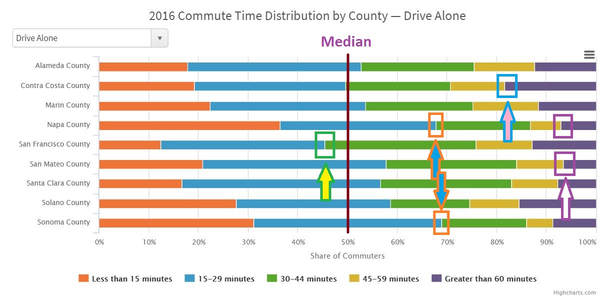 |
| http://www.vitalsigns.mtc.ca.gov/commute-time |
...Under 30-Minute Commutes
Looking at the two orange boxes (near orange-blue arrows), we find in the two rural counties of Napa and Sonoma about 70% of commuters commute less than 30-minutes. There aren't many jobs there, nor many people, nor many towns. If you live in one of the few towns there, you probably work there or very close, and have an easy commute along local streets and/or unimpeded highways.
...Over 60-Minute Commutes
The highest percentage of long commutes (over 60 minutes) in the SF Bay Area occurs in Contra Costa County as indicated in the above chart by the Blue Box (with blue and pink arrow) at around the 82% mark. This is because Contra Costa County is a bedroom community remote from the job centers of Silicon Valley and San Francisco. The 18% of commutes that are over 60 minutes long is in stark contrast to the 6% or 7% of commutes in Napa and San Mateo (Purple Boxes) that are over an hour.
We can see the disparity between the longest and shortest commutes and the difference between solo driving and public transit by state in this visualization (click to enlarge to readable size):
Average Commute to Work by State and City
Yellow bars are drive solo, brown bars are public transit, red lines are overall averages
 |
| Longest Avg. Commute = NY State = 33.4 Minutes Shortest Avg. Commute = South Dakota = 16 Minutes Red line "total averages" are almost all close to "solo driving" averages because (except for NY) only about 5% of commuting is done by public transit. http://www.visualcapitalist.com/average-commute-u-s-states-cities/ |
- Long commutes are the "man bites dog" aspect of news reporting. That about half of all commutes are unexceptional and under 30 minutes is not newsworthy or likely to generate any conversation on social media.
- Most people don't "get" what an average is. If the average commute time for two people is 30 minutes that could be that each has a 30 minute commute or it could be that 1 person has a 10-minute commute and the other has a 50-minute commute. Same average but vastly different experiences. One commute is a news item and one isn't.
- That it is "only" about 30 minutes by car in LA and San Francisco does not express the tension and frustration of stop-and-go freeway traffic on people. Auto accidents are expensive and often deadly - this increases the tension as people try to drive. Avoiding an accident on curving freeways with people changing lanes to save a minute or two is nerve-wracking and makes 28 minutes "feel like" 2 hours.
Driving in LA can be Dangerous

Driver assist technologies such as automated lane-keeping, "dynamic cruise control" (keeping a safe distance between cars), and collision avoidance can alleviate a lot of the tension from commuting. With less stress, there should be fewer people engaging in dangerous (and rude!) behavior - which would make commuting nicer and far more tolerable.
But if half of all commutes are under 30 minutes, then what is all the concern about traffic? What most people are thinking of when they talk about bad traffic is...
Rush Hour Congestion.
The Nerve-Wracking Aspect of Commuting

I was going to cover congestion and long distance commuting (mega-commutes, stretch-commutes, etc.) but those topics turn out to be really complicated with a lot of variations. They would easily double the length of this post so I will cover them in another post.
As a small preview of that post - one item is that around 40% or more people work what are called "anti-social hours". That doesn't mean they don't like people but that they are working at times most people are sleeping. Examples would be the midnight to 8 AM shift in a hospital, or coming at 5 AM to open a coffee shop at 6 AM then going home at 2 PM. This means half the population never faces congestion. They cruise to work on deserted streets and highways at (or above) the speed limit.

Conclusion:
The cost of commuting in terms of stress and money means some are willing to pay more to live closer to work. Others, by preference and/or trade-offs between housing costs vs. commute time choose longer commutes. You can't change people's preferences - everyone is different.


As a small preview of that post - one item is that around 40% or more people work what are called "anti-social hours". That doesn't mean they don't like people but that they are working at times most people are sleeping. Examples would be the midnight to 8 AM shift in a hospital, or coming at 5 AM to open a coffee shop at 6 AM then going home at 2 PM. This means half the population never faces congestion. They cruise to work on deserted streets and highways at (or above) the speed limit.
LA Freeway - Without Traffic
Conclusion:
The cost of commuting in terms of stress and money means some are willing to pay more to live closer to work. Others, by preference and/or trade-offs between housing costs vs. commute time choose longer commutes. You can't change people's preferences - everyone is different.
"You say To-MAY-to, I say To-MAH-to.."

We have looked at every state in the US, every country in the OECD (developed countries), some developing countries and various parts of each metro area. Looking at the averages and distributions of times we found over and over and Over that most people arrange their lives so that commute times are somewhere under 30 to 40 minutes.


_RYB17.png)