Search This Blog

Monday, March 5, 2018

SF Bay Area (2): Live-Work-Commute

SF Bay Area (2): Live-Work-Commute

Introduction:

This is part 2 of an exploration of jobs, commuting, and housing in the San Francisco Bay area.
Link to this post (for sharing): https://meetingthetwain.blogspot.com/2018/03/sf-bay-area-2-live-work-commute.html
Part 1 is here: http://meetingthetwain.blogspot.com/2018/03/sf-bay-area-1-live-work-commute.html

In part 1, we saw that San Francisco and Santa Clara Counties had added the most jobs resulting in a "housing deficit" in the two counties while other counties were either in approximate balance or had a "housing surplus" (i.e., bedroom communities).

Now, in part 2, we look at how this changed over the period 2002 to 2015.    We find that most counties had a pretty consistent "housing deficit" or "surplus" over the 14 years looked at.  The big exception was San Francisco.  San Francisco started out with a large housing deficit which then got much worse very quickly as it added a lot of jobs and very little housing over most of the period examined.

Then we explore the effect on commuting.  We see a 16% growth in workers in the 14 years since 2002 but a much bigger growth in long distance commutersThose commuting 25-to-50 miles and those commuting over 50 miles grew 26% and 49% respectively.  This has caused a massive impact on traffic.  Looking at the total Vehicle Miles Traveled (VMT) we find those long distance commuters - those who travel over 25 miles - are only 27% of workers but cause 66% of the traffic (VMT).

We are using the tool "OnTheMap" which I have described here:
http://meetingthetwain.blogspot.com/2016/12/how-to-use-onthemap.html

Job Increases and Decreases:

In the 9 county region, from 2002 to 2004, the number of full-time jobs decreased (aftermath of "dot-com" bubble), recovering to 2002 level in 2008, and then decreasing again after the housing bubble burst.  The number of jobs did not get back to 2002 levels until 2011.  Job growth did not really take off until 2012.  Click on graph to enlarge:
557,000 jobs added since 2009 = 19% increase = avg. of 3% per year.
467,000 since 2002 = 16% increase over 14 years = avg of 1.1% per year
Same thing - less dramatic - based at zero instead of 2,700,000:
Number of jobs remarkably steady for 10 years then (barely) exceeds 2002 level in 2012.
You often hear "NNN thousand jobs have been created since 2010 and not enough housing has been built."  Several reasons for that.  Reason 1: In 2010, the number of full time workers in the SF Bay areas was below 2002 levels (see above chart).  If there was enough housing in 2002, there was no need to build any more in 2010.  Reason 2: Housing prices were declining from 2007 through 2012.  No one will build new houses when prices for existing houses are going down.  See the following graph:
https://www.paragon-re.com/trend/3-recessions-2-bubbles-and-a-baby
Declining housing prices is a clear message there are more houses than buyers - too many houses for the existing market - no more needed.

It takes 2-years from breaking ground to finishing construction of an apartment.  It takes 5 minutes for a CEO to decide to hire more employees.  The housing supply will not catch up with demand until the increase in demand (i.e., increase in workers) pauses for a few years.  We discussed this in more detail here: http://meetingthetwain.blogspot.com/2018/01/housing-jan-2017.html

Job Growth:

We show job growth by county in the following chart (click chart to enlarge).  To compare the counties, we start each county at 100% in 2002 and chart it's growth.  San Francisco had by far the greatest job growth in percentage terms from 2002 at 35%.  Santa Clara is number 2 at 16% with the other counties at smaller percentages down to Alameda at 7%. As before we group the 4 North Bay counties of Marin, Sonoma, Napa, and Solano as one entity.  (click chart to enlarge)
San Francisco stands out as most job growth at 35% higher than 2002
Alameda County had least at 7%
Several counties with 9-10 years negative job growth from 2002 until 2011-2013
In the above chart we see that all counties had negative job growth in the aftermath of the 1990's Dot-Com bubble.  Most counties had dramatic downturns after the "dot-com" bubble burst in 2000.  They had barely recovered in 2007 when the "housing bubble" burst.  San Mateo, Santa Clara, and Alameda counties had extended negative job growth and didn't get back to 2002 job levels for 10 or 11 years (2012 and 2013).

Some counties recovered more quickly, notably San Francisco.  San Francisco stands out further in having only a very minor 1 year decrease (2009) in job growth due to the 2007-2012 "Great Recession".  Other cities in the SF Bay area suffered much longer declines in jobs lasting 3-5 years.  San Francisco exceeded 2002 job levels by 2007 and never looked back.
Creating jobs is all well and good, but the question of the day is housing.  Did housing growth keep up with job growth (where there was growth)?  We look at each county from 2002 to 2015 in terms of "housing deficit".  If a county has a 20% more jobs than resident workers it has a "housing deficit" of -20%.  If there are 10% more jobs than resident workers, the county has a "housing surplus" of 10%.

The following chart (click on chart to enlarge) shows by county the housing deficit or surplus over the 14 years from 2002 to 2015. It is information heavy so we discuss several counties below.  Click Chart to enlarge.

Percentage Housing Deficit
San Francisco 55% Housing Deficit
Contra Costa 25% Housing Surplus
Horizontal Red Line in Center is "Perfect Balance" of Jobs-Housing
The key point is that counties are pretty consistent over the 14 year period.  They are in a negative "housing deficit" (below the red line in the middle), "near balance" or positive "surplus" pretty consistently throughout the 14 years 2002 - 2015.

Looking at several counties in detail:

Contra Costa
had a housing surplus of +25% in 2002, and exactly the same surplus in 2015.  In the intervening years the surplus bounced between a narrow range of +19% and +26% averaging +22.5% +/- 3.5%.  This means that on average, nearly 1 in 4 residents commuted out of  the county for a job in another county.  (Click on chart to enlarge:)


Santa Clara County, had an even narrower range (but a housing deficit) of -18% to -13% averaging -15.5% +/- 2.5%.  This means that, on average, for every 7 jobs there was housing for only 6 workers - another worker had to commute in from a neighboring county.

San Francisco is the exception - a big one!  It started bad with a -42% housing deficit and deteriorated further to -55%.  From very bad to even worse!  This means that on average, for every 3 jobs, there was housing for fewer than 2 workers - a third worker had to commute in from another county.

Commuting and VMT


As the jobs increase in one place but the housing increases in another place, more and more workers need to commute further and further.  While this is to be expected, the extent of this is astonishing.  The following graph shows a huge increase - about 50% - in the percentage of commuters who travel more than 50 miles to get to work (purple line).  The percentage commuting 25 to 50 miles (green line) increases over 25%.  The percentage commuting less than 10 miles (blue line) actually declined from 2002 until 2014 only going above the 2002 level in 2015. (click chart to enlarge).


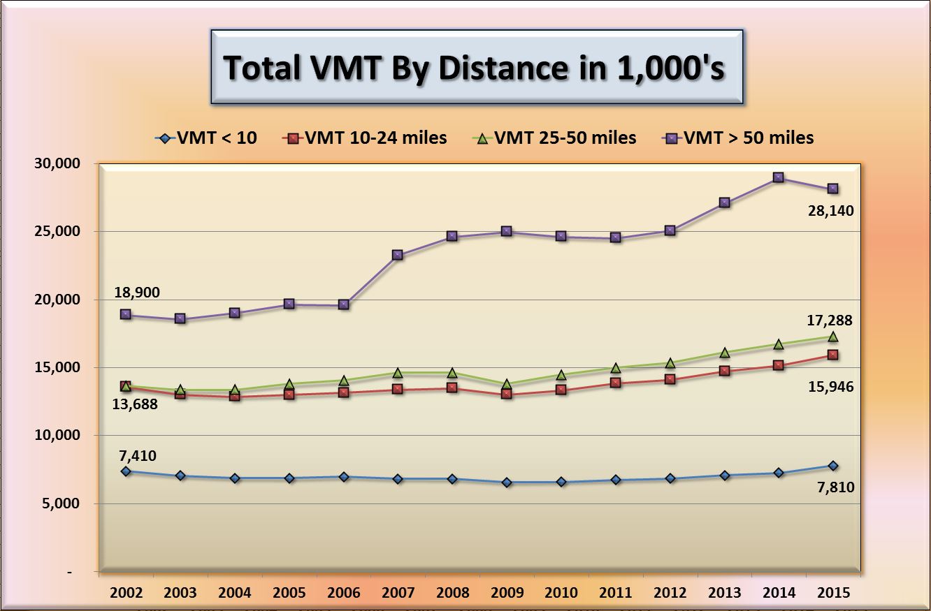
The following graph shows the numbers of those commuting in each commute range:

The numbers of commuters in the longer ranges don't look too big compared to the number in the shorter ranges.  But note that there is almost a 50% increase in the longest range commuters (over 50 miles) from 315,000 to 469,000.  These long distance commuters have an out-sized effect on "Vehicle Miles Traveled" (VMT) which is the standard metric for traffic.  VMT is simply the sum of each commuter's miles traveled.

For example, if 10 people each commute 10 miles each, that gives us:
   10 vehicles x 10 miles traveled each = 100 VMT (Vehicle Miles Traveled)

If one more person is added who commutes 100 miles, that changes the calculation to
(10 x 10) + (1 x 100) = 200 VMT.  See graphic below:
Lots of Cars drive a little or One cars drives a lot.  Same problem.
In this example, a 10% increase in commuters resulted in double the VMT because of the longer distance traveled by that commuter.  That means double the gas consumed, twice as much commute infrastructure required, 100% more Green House Gases emitted.


Next chart is the VMT change by year for the nine-county SF Bay Area.  You notice a complete reversal in the VMT compared to the earlier commute range population chart.  There are over 3 times more people commuting less than 10 miles but the longest range commuters (greater than 50 miles) contribute nearly 4 times the VMT.


What does this mean from a practical point of view for you, the commuter?  Consider two situations where you are driving 50 miles on a very crowded freeway.

In case A, everyone else is driving the exact same distance as you, and it is stop-and-go all the way because everyone wants to drive 50 miles.

In case B it is just as crowded but now everyone (except you) enters the freeway, drives exactly 1 mile, and then exits the freeway to be replaced by another commuter who does the same.

From your point of view, there is no difference.  The road is just as crowded in either case.  However, in case B, lots of people go short distances - the freeway has accommodated 50 times more commuters in case B.

What we have in the SF Bay area is Case A.  A small proportion, 27%, of long distance commuters (greater than 25 miles) are clogging the roads.  The ever worsening traffic is due to the 30% increase in VMT which is mostly due to the long range commuters.  Let's compare 2002 to 2015 to see the change:

The orange and green segments (commutes "over-50" miles and "25-to-50" miles, respectively) are only 27% of the drivers.  That 27% of long distance commuters (over 25 miles) cause 45,000,000 of the 69,000,000 Vehicle Miles Traveled.  I.e., 27% of the drivers cause 66% of the total Vehicle Miles Traveled and therefore traffic and congestion.

(Note on VMT calculation: I took the midpoint of each range so 0-10 miles range was computed using 5 miles times the number of those commuting less than 10 miles.  Similarly for other ranges, 10-24 miles was 17 miles x number of commuters, 25-50 was 37.5 miles x number of commuters, for over 50-mile commutes I used 60 miles x number of commuters.)

Much more to say but this is getting too long.  Part 3 coming soon.

Thursday, March 1, 2018

SF Bay Area (1): Live-Work-Commute

SAN FRANCISCO BAY AREA

Part 1 of an examination of living-working-commuting patterns in the nine-county San Francisco Bay Area.  Which counties have good jobs-housing numbers and which are skewed?

Part 2 is here:
http://meetingthetwain.blogspot.com/2018/03/sf-bay-area-2-live-work-commute.html

Link for sharing this posthttps://meetingthetwain.blogspot.com/2018/02/sf-bay-area-1-live-work-commute.html
Image from: https://mymodernmet.com/san-francisco-bridges-beautifully-blanketed-in-fog

Summary:
In looking at jobs-housing-commuting patterns in the San Francisco Bay Area by county or group of counties, we find most counties are in approximate balance.  I.e., they provide housing for about as many workers as they have jobs for.  Many commute from one county to another, but with two exceptions, the housing for workers within each county balances out or there is housing for more workers than there are jobs - a "housing surplus".

The two exceptions are San Francisco and Santa Clara counties.  Contrary to popular belief, the biggest increase in jobs is not Silicon valley, but San Francisco.   The US Census Bureau tool "OnTheMap" shows that in the graphic below:


SF has 642,375 jobs, and 413,766 workers.  They are short of housing for 228,609
SF would have to increase their housing over 50% to accommodate all those workers.
"OnTheMap" described here: http://meetingthetwain.blogspot.com/2016/12/how-to-use-onthemap.html
To correct San Francisco's housing imbalance they would need to add 55% more housing units increasing total population from 871,000 to 1.35 Million!  An increase of over 500,000.  Instead, San Francisco is adding even more jobs than housing, making their jobs-housing imbalance even more extreme.  This is resulting in billions of dollars more infrastructure for additional bridges, freeways, and BART lines to get workers from their home counties to San Francisco.

Because of it's larger population, Santa Clara County's "housing deficit" of 114,000 would require only 14% more housing units.  With lots of open space and more businesses moving to central San Jose this can be done without too much strain.

This is part 1 of a a multi-part series on the SF Bay Area county live-work-commute issues.  Previous explorations have focused on cities in Santa Clara County.  The most recent on Palo Alto is here: http://meetingthetwain.blogspot.com/2018/01/palo-alto-work-live-commute.html

Nine County Basic Info:

Population:

A map of the nine counties is seen below.
Four "North Bay" counties in blue, two "East Bay" counties in yellow
Counties listed below by population:
  1. Santa Clara: Population 1.8M, County seat & largest city: San Jose, Pop. 1M
  2. Alameda: Population 1.5M, County seat & largest city: Oakland, Pop. 412,000
  3. Contra Costa: Population 1.1M, County seat Martinez, largest city Concord: Pop. 129,000
  4. San Francisco: Population 871,000
  5. San Mateo: Population 765,000, County seat Redwood City, largest city Daly City: Pop. 101,000
  6. Sonoma: Population 503,000, County seat & largest city Santa Rosa: Pop. 186,000
  7. Solano: Population 440,000, County seat Fairfield, largest city Vallejo: Pop. 121,000
  8. Marin: Population 261,000, County seat & largest city San Rafael: Pop. 59,000
  9. Napa: Population 142,000, County seat & largest city Napa: Pop. 80,000
(Data above from county entries in Wikipedia)

Total population of the 9 counties bordering the San Francisco Bay is 7.38 million.  

Some would include Santa Cruz County in the general "commute shed".  Santa Cruz County's population is 261,000.  Adding the population of Santa Cruz County to that of the other nine counties gives a grand total of 7.64 million for the ten counties.

The 4 northern counties of Sonoma, Solano, Marin, and Napa are the least populated.  Census data (shown later) reveals that most commuting in that northern four county area is within the same four counties.  The entire four counties can be considered a "bedroom community" - relieving the strain on housing for San Francisco.  From now on, we will treat them as a single entity on par with the other counties.  (Click on chart to enlarge)

SF Bay Area Population & Households

Income:
Income per capita below.  San Francisco County has the highest per capita income in California at nearly $50,000, except for Marin County ($58,000).  Marin County has only 261,000 people (2017) - less than 30% of San Francisco's population and less than 3.5% of the entire nine-county region.

Per Capita Income By County
Average = $41,000
Source: https://en.wikipedia.org/wiki/List_of_California_locations_by_income
Income rankings "per capita" differ slightly from "per household" rankings.  This reflects the larger number of non-workers (children, retirees) in some places like Contra Costa County compared to e.g., San Francisco.

Workers:

We are interested in exploring job-worker imbalances.  That is, "has County X created more jobs than housing? "  If so, then some other county has to create more housing than jobs.

(Data is from the US Census tool "On the Map".  I describe how to use it here: http://meetingthetwain.blogspot.com/2016/12/how-to-use-onthemap.html )

The next chart shows each county's number of primary (not part time) jobs, and how many residents in that county were employed full time somewhere - not necessarily in the county in which they live.  The blue bar shows how many fully employed workers reside in that county (who may work in other counties), the gold bar shows how many primary jobs there are in that county.   If there are more jobs than workers, there is a "housing deficit" in that county which must be made up by some other county providing more housing for workers to commute from.

2015 Jobs, and Resident Workers
San Francisco Bay Area


Reading the above bar chart:

1.  The first pair of bars shows Santa Clara County has a "housing deficit" - the difference between the bars.  The blue bar shows about 820,000 workers residing there (who may work in other counties).  The gold bar shows about 934,000 jobs.  Subtracting we get (943,000 - 820,000) = 114,000 net workers for whom there is insufficient housing in Santa Clara County.
Santa Clara 820,000 Workers & 934,000 jobs.  "Housing Deficit" of 114,000 workers.
The next most populous county, Alameda, has almost exactly the same number of jobs as resident workers (blue bar and gold bar about equal).  Perfect jobs-housing balance.

The next set of bars for the four northern counties and Contra Costa County shows more workers than jobs.  There is then a net "housing surplus".  This means those counties are "exporting" workers to the counties that have more jobs than workers.  These five counties are typically called "bedroom communities".

Continuing down, we see San Francisco has a huge "housing deficit" - blue bar (housing) much shorter than the gold bar (jobs).  With 642,000 jobs and only 414,000 workers, there is a "housing deficit" of 228,000.  That is a shortage twice the size of Santa Clara's even though Santa Clara County has over twice the population.

414,000 Workers & 642,000 jobs.  Short housing for 228,000 workers.
And last is San Mateo with a negligible "housing deficit"

Most county and state governments prefer more jobs since commercial enterprises generate a lot of tax revenue per acre but don't use a lot of expensive services like parks, schools, police.  A few towns within each county, like Atherton in San Mateo County, are willing to pay higher property taxes to have very little commercial activity and a more rural environment.  They're richer and can afford it.  Less rich cities prefer more jobs than housing for the extra revenue.

Atherton - Right next to Redwood City
Redwood City - Right next to Atherton
Creating more jobs than housing has several additional negative repercussions: it forces more people to commute from counties with housing to counties with jobs thus clogging roads and wasting time.
"Housing Deficit" = time wasted commuting
It also drives up the price of housing in the job-rich city as people wishing to avoid the commute bid up an insufficient number of houses near work.
Bidding wars on housing to be close to work and avoid the commute

Job Growth 2002 to 2015:

Which counties are the major job centers is no surprise.  Santa Clara County has the most jobs, followed by Alameda, San Francisco, and San Mateo counties as seen in the following charts:
Percentage of Jobs in Each County in 2015
Every county added jobs over the period 2002 to 2015.  Many think of the high growth in jobs as being primarily in Silicon Valley - particularly in the counties of San Mateo (Facebook, Oracle) and Santa Clara (Google, Apple, and many others).  But the biggest growth in jobs was in San Francisco, even though San Francisco is only in fourth place in terms of population.

Absolute numbers of jobs added
San Francisco #1 at 165,000 
Santa Clara #2 at 127,000

Jobs added by San Francisco exceeded that of the lowest six counties combined!  Jobs added by the bottom six counties (Marin + Sonoma + Napa + Contra Costa + San Mateo + Alameda) = 150,000, still 15,000 short of San Francisco's 165,000.

Percentage growth:

Many more jobs - 32% of the total growth (nearly one in three new jobs) - came from San Francisco alone as seen in the graph below (click on images to enlarge).

From 2002 to 2015
517,000 Jobs Created in SF Bay Area
32% of them were in San Francisco

All 9 counties increased jobs. 
People commute in and out of every county since not everyone who lives in a county works there and not everyone who works there wants to live there.  We see imbalances in the graph below which shows how many commute out of a county, how many commute in, and the net flow - the in-flow minus out-flow of commuters.  (For this analysis, we don't show the many commuters who both live and work in their county.)

For example, in the first three bars below we see that San Francisco had 387,000 workers commute in (blue), 159,000 commute out (red), so net flow was 229,000 commuting in (yellow).  That means San Francisco was short of housing for 229,000 workers.  Santa Clara also had a net influx of 114,000 commuters.  All other counties either were in approximate balance or had a net flow out.  The results for all counties is seen in the graph below:

2015 Commuters: In - Out - Net
San Francisco worst with 229,000 housing deficit
Contra Costa best with 112,000 housing surplus
Contra Costa and the four N. Bay counties are providing more housing than jobs.

San Francisco's Huge Housing Deficit
Dramatic increase in housing needed.
Not going to happen!

San Francisco has 414,000 resident workers.  They need to "import" 229,000 additional workers to fill the full time jobs they have.  Adding housing for 229,000 more workers over the current 414,000 resident workers to erase San Francisco's "housing deficit" would be a 55% increase!  Adding 55% more workers and their dependents to the current population of 871,000 would result in an increase of 479,000 for a total population of 1,350,000.  A 55% increase in the 529,000 households (see first bar chart) would be 291,000 additional households.  I.e., 291,000 additional "housing units"!

There is zero chance of that occurring.  The current building pipeline is only going to make it worse.  We learn from Paragon Real Estate's June 2017 report

"Building Cranes Everywhere"

"Approximately 64,000 housing units, 31 million sq.ft. of commercial space & 25 hotels with 4685 rooms are now in the SF new construction pipeline - with 5700 units, 10 million sq.ft. and 5 hotels currently under construction. "


As the attached graph shows, many of those housing units are "planned" (in the very loosest sense of the word) for 2027 to 2042.  That is 10 years to 25 years out.  That far into the future is more in the realm of idle speculation than actual planning.

The 31 million sq. ft. of office space will accommodate anywhere from 77,500 (400 sq. ft. per worker) to 124,000 more workers (250 sq. ft. per worker).  Split the difference and call it 100,000 more jobs.

So they are "planning" for even more workers than housing - falling even further behind in supplying housing for it's job holders.  With a current 291,000 housing deficit they are adding 100,000 more jobs but only 64,000 more housing units - over 25 years.  The deficit will increase from 291,000 to 327,000.  Words fail me.

https://www.paragon-re.com/trend/june-2017-crazy-hot-san-francisco-market-again
The commute gets worse, the required infrastructure costs more.
https://www.sfchronicle.com/bayarea/article/BART-gets-serious-about-a-2nd-East-Bay-S-F-12628607.php
"...It would be the biggest Bay Area infrastructure project, probably, since the BART system was built more than 50 years ago, and it would cost twice as much as the new Bay Bridge, from $12 billion to $15 billion at a minimum."

Actually, the new Bay Bridge was proposed as a 2 year, $2 billion project.  It took 10 years and cost $10B.  If they are suggesting $12B to $15B perhaps we should be thinking $60B to $75B.

There is much more to say but this is already too long.  Part 2 is here: http://meetingthetwain.blogspot.com/2018/03/sf-bay-area-2-live-work-commute.html