Search This Blog

Wednesday, January 31, 2018

Housing - Jan. 2018

SF Bay Area Housing Update 1/31/2018:

San Francisco Housing
This is a 1 year update of my earlier post:
http://meetingthetwain.blogspot.com/2017/02/is-there-housing-crisis.html
Everything in that earlier post is still relevant, but I thought I'd update some of the housing data and add more historical context. 

Link to this post for sharing:
https://meetingthetwain.blogspot.com/2018/01/housing-jan-2017.html

Summary:

  • We are in the middle of a housing boom.  As booms go, it is not particularly unusual - bigger than the last one, but not as big as two earlier booms in the 1980's and 1990's.  Housing prices go up with employment.  They are still going up after almost 5 years of increases (they started increasing in 2013).  This followed 6 years of price declines (2007-2012).
  • Land is so expensive, only luxury housing can be built.
  • A lot of apartments and condos are in the pipeline nationwide and in the SF Bay area.  This should result in a halt to price increases.
  • SF Bay area housing costs over the last 32 years have gone through 4 boom-bust cycles.  During booms they went up as much as 100%.  During busts they have gone down 10% to 27%.  Currently they are up 75% from their 2013 lows.
  • Growth in high wage jobs causes housing inflation.

Discussion:

The rise of housing costs was starting to subside in the SF Bay Area last year as companies expanded elsewhere.  This seems to have been a temporary lull.  Hiring is still increasing faster than housing can be built in the SF Bay Area.  The geographical area occupied by tech employers is expanding in an ever-widening circle raising housing costs in increasingly remote areas.
Housing prices rose in last 18 months
15% in lowest 3rd of housing
10% in middle 3rd
6% in highest third
https://www.paragon-re.com/trend/3-recessions-2-bubbles-and-a-baby
As housing booms go, this current boom is not all that exceptional.  The affordability across counties in the San Francisco Bay area is reminiscent of 1991 (far left of the following chart) when it started rising to 20% (of residents could afford to buy a house in SF) or 40% (far out in Sonoma County).  The chart below makes it clear that affordability goes up in recessions and goes down in economic growth periods.  Affordability is higher in further out counties like Sonoma than the job centers of San Francisco and San Mateo. (click chart to enlarge)
https://www.paragon-re.com/trend/3-recessions-2-bubbles-and-a-baby
At no time in the last 26 years have more than 28% of San Francisco residents been able to afford a house in San Francisco.  Most of the time it has been bouncing around between 10% and 25%.  SF is expensive now, has been in the past, and will be in the future.  Even in Sonoma County the percentage of people who can afford a house has varied from 10% to, at the very most, 50%.  Usually affordability is around 30% meaning only 30% of residents can afford to buy a house.  This is not a crisis.  This is a permanent condition.

The affordability peaks occur during economic downturns and the low affordability points occur during economic booms (bubbles).

In other words,
Either: lots of high paying jobs and high housing costs
Or: jobs are hard to get and pay little, but housing is cheap(er).
Either way  - it's cheaper further out.
Possibly the least surprising economic correlations - ever.

Because of the increasing concentration of high paying jobs, land is becoming so expensive that it is the overwhelming part of housing costs.  The high price of land makes it impossible to build anything but luxury housing in or near Silicon Valley or most of the SF Bay Area.

As a result, housing prices are reaching new highs in the mid and high priced homes and the lowest 3rd of homes by price are close to their 2007 bubble highs as seen in the following chart.  (click to enlarge)
https://www.paragon-re.com/trend/3-recessions-2-bubbles-and-a-baby
Consider, for example, the cost of a vacant plot of land in Sunnyvale (assuming you could find one).  Such a (hypothetical) vacant plot would cost about $1.6M.  Constructing a small cheap house costing $150,000 in labor and materials compared to building a large expensive house costing $250,000 is the difference between a $1.75M and $1.85M base cost - less than a 6% difference.


Might as well build the large house and while you're at it, add granite counters, and marble bathrooms for another $40K - it's just icing on the cake.  Those luxury touches make the large $1.85M house a $1.89M house.  Who cares about the third significant figure?  So all new housing becomes luxury housing.
What the heck - why not?
The land costs so much might as well go whole hog.
Building up doesn't make this better because the increase in rental income makes the land even more valuable.  Land costs and density are examined in detail here:
http://meetingthetwain.blogspot.com/2017/01/live-work-commute-2.html

The following chart shows that as you get further out from the center of economic activity, the lower the rents.  Sprawl happens because people can't afford to live close in.
The closer you are to the center of economic activity, the more expensive the land.  So Lower Manhattan is more expensive per acre than its far suburbs.  Lower Manhattan, Silicon Valley and San Francisco are centers of economic activity.  They will never be cheap.  Chart is from: http://MarronInstitute.NYU.edu/content/working-papers/the-spatial-distribution-of-land-prices-and-densities


We have seen these bubbles before as seen in the following chart covering the last 33 years back to 1984:
FANG refers to "Facebook Apple Netflix Google"
For SF, include AirBnB, Uber, SalesForce.com, and some others
All growing very fast all at once.
https://www.paragon-re.com/trend/3-recessions-2-bubbles-and-a-baby
We can put these rises and falls (seen in the last chart above) into perspective by looking at a house that cost $250,000 in 1985.  Using the chart directly above to plot all the ups and downs to get to now when it costs $1.6M - see below (click image to enlarge).

A House Price Rises and Falls
$250K to $1.6M

Using the above chart we can see that buyers of a house in 1985 caught the beginning of a boom and felt "rich" 5 years later in 1990.  On the other hand, those buying in 1990 probably felt like chumps 5 years later in the slump of 1995 when their house equity went negative.  Then, 9 years later, in 1998, with the house back up 15% from where they bought it, they might have felt philosophical that "after all, a house is a home" not an investment.  By 2001, 11 years later, they were likely to feel like financial geniuses, and on, and on...

In fact, for all the talk about "housing crisis" this current rise is a relatively mild percentage increase in housing compared to previous booms - see the following chart.  The percentage run up in prices in the previous two economic cycles in 1985-1995 and 1996-2001 (Dot-Com bubble) was significantly greater - 100% vs current 75%. The latest run up in prices is sort of average right now, though in dollar terms they are new highs.  Less than the earlier two bubbles but greater than the US sub-prime housing bubble that burst in 2007.
Last 5 years = increased housing costs
After 6 years of decreasing housing costs
https://www.paragon-re.com/trend/3-recessions-2-bubbles-and-a-baby
The above chart points out the fallacy in the oft-repeated phrase "since 2010, [number] thousand jobs have been added and housing has not kept up."  2010 was the bottom of the "2007 Housing Bubble" recession.  Housing prices in the SF Bay area were declining from 2007 to 2012.
SF Housing Prices went down from 2007 to 2012

No one is going to build new housing if existing housing is losing value.  If prices are going down, then supply exceeds demand.  The market is saying "don't build!"  In that time period there were a lot of foreclosures, and mortgage defaults.
Blue line = Mortgages 90+ days past due
Red line = Foreclosures started
Worst since at least 1980
Housing construction could not reasonably be expected to start until builders were sure their units would sell at a profit - which means 2013.  Once all the paperwork is done and the land purchased and the house designed it still takes about 2 years to build new housing.  This means new employees added from 2010 to 2013 would not see any new housing until 2015 at the very earliest.


Builders won't build for people that aren't here yet.  As long as new jobs are being added, construction will always be playing "catch up".   There will always be a "shortage" as long as jobs keep forming faster than housing can keep up.

As the companies expand, the increase in housing prices near work spreads out in an ever widening circle - like a drop of ink on tissue paper - meaning people who aren't getting the higher tech salaries have to commute from further and further away.

People keep asking me for a solution to this "problem".  It's a problem only if you want two things that are incompatible, in which case, the problem is you.

If you want continued growth in high income jobs, then housing will keep rising in cost.
If you want housing costs to stay constant, then you can't have continued growth in high paying jobs.

One or the other, make up your mind.
You get to choose (or, maybe not)
The following chart shows how much you need in salary to buy a house in any of 50 US metro areas.  San Jose is at the far right at over $200K, San Francisco is next to it at $175K.  The average for all 50 metro areas (center maroon bar) is slightly above $50K.  (click graph to enlarge to readable size.)
Salary Needed to Buy a House in 50 US Cities.
San Jose (red) at far right, San Francisco (purple) next to it.
National average in middle (maroon)
Chart from Nov. 2017 data at
https://www.hsh.com/finance/mortgage/salary-home-buying-25-cities.html
Where more high salary jobs are added, the housing prices will reflect what (some) people can buy.  Those houses won't sell unless someone can buy them.  It may not be you, but someone has the money for that house.  Those that can't keep up need to figure out whether it it is worth staying or moving to one of the the many lovely other parts of America, the Beautiful.  Adults make choices and accept that there are trade-offs with any decision.
"O beautiful for spacious skies,
For amber waves of grain,"
1893 Poem by Katherine Lee Bates
Perhaps the anger floating around about housing costs can be directed at the companies that can't figure out how to create jobs outside the SF Bay area.  They can have R&D centers in India but not Indiana?
Purdue University
Indianapolis, Indiana
There is in fact an enormous amount of building going on around the country including the SF Bay area.  As a result, a huge number of single and multi-family housing units (more than 5 units per building) will becoming available soon.  Single family housing starts are near 10-year records.  See following charts:


Multi-family housing inventory is about to get it's biggest increase since 1975 (43 years ago).


Housing price swings are a regular feature of the US economy as seen in the following chart from census data from 1963 through mid-2011 (click on graph to enlarge):


So how is this boom different?  Mainly in the builders' PR.  By terming this, not particularly exceptional boom, a "housing crisis" and getting everyone to accept that term, they create a panic-driven urge to over-ride all reasonable zoning limits.  And ignore the problems of getting people to and from work.
So you build lots of housing everywhere.
How do you get people in and out?
Well, many people are honest and trusting and aren't prepared to deal with profit-driven attempts to panic them.  A little cynicism is in order.  When you wake up and realize you've been manipulated it feels really awful.


Sunday, January 28, 2018

Climate Action: 2 - Rooftop Solar

PermaLink: http://meetingthetwain.blogspot.com/2018/01/climate-action-2-rooftop-solar.html

Roof Top Solar

1884 - World's first solar panels in NYC
https://electrek.co/2018/01/29/10-really-cool-solar-power-installations/

This is part 2 of a series.  Part one is here:
http://meetingthetwain.blogspot.com/2018/01/climate-action-1-polls.html

Rooftop solar is getting cheaper and is becoming a significant part of the energy generated in many states, including California.

First the (reealllyy) good news.  In 2006, the US Dept. of Energy made predictions of where our energy would come from in 2016.  Here it is 2016 and solar and wind generation in 2016 have blown way past the US Dept. of Energy's 2006 projections for where we would be now.  And coal, CO2 emissions, and total energy consumption have decreased tremendously!
https://www.statista.com/chart/11365/the-us-is-smashing-its-clean-energy-targets/
So the US is doing better than expected, but we could do better - much better - particularly in California where we have so much sun and connections to wonderful resources to share with other states like Wyoming (wind) and the Pacific NW (hydro).  By sharing resources, much of the entire Western half of the US could be 100% renewable energy very soon.

California has an excellent renewable energy resource in solar
NREL is the US Govt. National Renewable Energy Lab
California doesn't have great onshore wind but it has more high quality off-shore wind (Red and Dark Blue) than any other part of the US.


The state of South Australia (1.7M people) is already at 57% renewable energy and "The Australian Energy Market Operator predicts that the state is heading towards 80 per cent renewable energy by 2021/22".
 http://reneweconomy.com.au/south-australia-already-57-wind-solar-201617/

We have the potential in California to get 74% of our energy from just rooftop solar on all buildings.  Like Arizona and Utah we get a lot of sun but, unlike them we have a lot of buildings too!

http://www.renewableenergyworld.com/ugc/articles/2016/04/sharply-higher-rooftop-solar-potential-increases-opportunity-for-energy-selfreliance.html

Why not just let the power companies do it all by putting solar panels in the desert?  One reason is that the desert isn't deserted.  It has lots of critters on it that had nothing to do with changing the climate.  That is why the Sierra Club, the Natural Resources Defense Council and Defenders of Wildlife sued to prevent the Calico Solar Project.  The Desert Tortoise ("Threatened" on Endangered Species list) and other species need a large amount of contiguous land to forage in and sustain a large enough population to enable individuals to find partners for breeding.
https://www.washingtonpost.com/news/energy-environment/wp/2016/08/15/the-greens-and-solar-industry-agree-on-climate-but-they-cant-agree-on-the-california-desert/

Hey!  It wasn't me what changed things.  Clean up your own mess!
(Desert Turtle)
"We have focused instead on consensus building to improve as many large-scale solar projects as possible to transition our nation to clean energy sources while protecting wild lands and wildlife. The Calico project, however, is an example of a solar project done wrong from the start.”  (NRDC lawyer)
https://www.forbes.com/sites/toddwoody/2012/03/27/sierra-club-nrdc-sue-feds-to-stop-big-california-solar-power-project/2/#26aeb59b6dd6
Mojave fringe-toed lizard
Another desert species in the area
They shouldn't have their homes destroyed to power our buildings that are changing the climate.  The buildings (and we humans) that cause the climate change should take responsibility to stop the climate change.
Golden Eagles nest in Calico area
Other species habitat in the area:
Big Horn Sheep
White-margined Beardtongue -  very limited range
Does not transplant or propagate from cuttings
https://www.blm.gov/ca/pdfs/cdd_pdfs/whitemarg1.PDF

Details on Distributed Energy:


Another name for "roof top solar" is Distributed Energy Resources (DER) or just "distributed energy". This means energy is generated from many small sources geographically distributed.  This is in contrast to a few central power plants each generating enormous amounts of power.

Old style centralized power plant
New style Distributed Energy Resources can look very nice - fitting in with every style roof:
Tesla's Solar Roof "Textured Glass Tile" style
https://electrek.co/2016/10/28/tesla-solar-roof-options-gallery/
Covered with Tesla solar panels!  Who knew!
https://electrek.co/2016/10/28/tesla-solar-roof-options-gallery/

These are the Tesla solar panels on the house above.
If we are going to save the planet we must move from natural gas for cooking and heating to electricity for everything - cooking, home heating, and hot water.  Natural gas for space heating and hot water heating is 50% of the energy and GHG emissions from buildings in California.  That means that switching from natural gas to electricity will double the amount of electricity each building will need.  We will need to substantially increase our electricity generation to get off of natural gas.  Where better to do this than the buildings themselves?

And it has gotten a lot cheaper over the years as seen below (click graph to enlarge):
https://www.nrel.gov/docs/fy17osti/68925.pdf
page vi
The above graph shows the tremendous drops in solar's installed price per Watt by 2017.  Residential prices in 2017 were about where Utility prices were 5 years earlier and where commercial prices were 3 years earlier.

Note in the above graphs that for residential construction, most of the cost is sales.  Having a lot of sales staff running around making bids on each house is expensive.  Further, in some cases the structure must be strengthened to support the extra weight of solar panels, holes drilled in the roof must be covered and sometimes the electrical system upgraded.  Bringing an installation crew out to each house is expensive also.
Getting a crew out to each house is a lot of overhead adding to costs.
On new construction however, you get economies of scale since typically you are building several houses at once or a large apartment building so the sales component diminishes greatly saving about 30% of the cost.  In addition, the roof, structural support, and electrical wiring can be designed with solar panels in mind, saving more money.  Since the roofing and electrical workers are working on the house anyway, there is no travel cost getting them to each unit.


Putting solar panels on all new construction and gradually adding it to existing buildings sounds great, right?!  Save life on the planet and lower your electric bills while still looking good.  The US govt. (and that of many other countries) gives tax breaks to encourage roof-top solar, as does the state of California and most states in the US.  Even Republicans in Congress are in favor of it as witnessed by their keeping in the tax breaks in their new tax package.  Who could be against roof-top solar?


It turns out the electric companies are against it.  The obvious reason is because they don't get any money from you supplying your own electric power.  In 2014, Mark Ferron, the former head of the California Public Utilities Commission said, "I suspect that they [utilities] would still dearly like to strangle rooftop solar if they could." and "the commission will come under intense pressure to use this authority to protect the interest of the utilities over those of consumers and potential self-generators, all in the name of addressing exaggerated concerns about grid stability, cost and fairness."
More here: https://www.greentechmedia.com/articles/read/read-this-retiring-utility-commissioners-candid-words-about-energy-policy

The utilities' argument is the "Duck Curve".

Let's see.  People like ducks, right?
And nothing wrong with a curve.
So if I combine the two it will look perfectly innocent.
Damn, I'm good!
I was going to include a complete discussion of the "Duck Curve" in this post but it quickly turned lengthy enough to merit its own post (or two).

Still, I need to give a "Reader's Digest" version of it before ending.

The "Duck Curve"


The "Duck Curve" (shown above) gets mentioned a lot in discussions about moving to 100% renewable energy.  The graph below (without the duck) was originally created by the California Independent System Operators (CAISO or Cal ISO) in 2013 to show how the increase in solar to meet California's RPS (Renewable energy Production Standards) would result in sharp drop in midday followed by a steep climb in demand after 5 PM.  The claim is this could cause over-generation and risk instability in the electric power grid causing brownouts, blackouts, or harmful variations in frequency and voltage.

This has been used by those in the power generation industry to argue against adding more solar power right now.  The 2013 projection of a severe dip in daytime "load" by 2020 followed by a steep rise around 5 PM actually came true earlier - in 2017.

The argument is that a lot of costly storage and/or "peak power" plants will be needed to very quickly ramp-up power generation after 5 PM.  And therefore (the power companies argue) we shouldn't encourage solar panels everywhere because it will just be too costly now.  The power companies acknowledge that eventually we will need to get to 100% renewables, just not quite yet.  When storage gets cheaper in the (indefinite) future, they suggest.


About the duck curve argument, Mark Ferron, former head of the CPU said "We need to declare hunting season on the Cal ISO’s duck chart!” ..."Judging from the cheers he got from the pro-solar crowd, he’s not the only one who wants to see the chart shot out of the skies of the policy debate on the state’s solar-powered future."  C.f., Chttps://www.greentechmedia.com/articles/read/retired-cpuc-commissioner-takes-aim-at-caisos-duck-curve

The counter arguments basically boil down to "Yo!  Big power utilities!  That's your problem - deal with it!"

Maybe a little more detail would be in order so...

It's important to note that the "duck curve" as commonly shown is misleading on several counts.  First of all, the bottom of the above "duck curve" is not zero.  Shown to scale it is nothing like as dramatic as seen earlier.  Compare the two examples in the following diagram for 2016.  The left diagram looks sooo dramatic (a crisis! "Something Must Be Done!") because the lower bound is 14,000 MW, not zero.  The right graph shows the curve in context (base at 0 MW) and it isn't scary at all.

https://ilsr.org/report-electric-vehicles/
The other way it is deceptive is that about half of the year there is no "duck curve" at all.  For 5-6 months the sun is up longer, air conditioning is often running, and net power demand does not decrease in mid-day - see below.
"Duck Curve" is very pronounced in December, and March
But no duck curve at all in June and September.
Here's a chart of charts for each month in 2014:

Above from US Energy Information Agency
Steep ramp in late afternoon but used to be steep ramp in early morning
https://www.eia.gov/todayinenergy/detail.php?id=19111
What you see above is a mini-chart for average load each month showing that there is a "duck curve" from October through April but none at all for May through September.  In fact solar decreases the steepness of the mid-day peak in those months allowing for a more gradual ramp up of power generation.

Here is a another set of monthly averages.  Load" = all electricity demand.  (Note the bottom of the left axis is not zero.)  "Net Load" is load minus (solar + wind) (click to enlarge):
Can you find the "duck"?
From page 15 of:
http://docs.cpuc.ca.gov/PublishedDocs/Efile/G000/M157/K905/157905349.PDF
You can get the most recent load and generation charts for any given day up to today at the CAISO web site here: http://www.caiso.com/green/renewableswatch.html  Just click on "Daily Renewables Watch for [date]" and you will get a very nice 2 page PDF for any day you seek back to 2010.  Here's parts of the one for a day in the year with very little sunshine - Thursday, December 14, 2017:


Thursday, December 14, 2017
Light Blue "Thermal" refers to burning coal or natural gas.
""Duck curve" (such as it is) same in early morning and late afternoon.
http://content.caiso.com/green/renewrpt/20171214_DailyRenewablesWatch.pdf
Here's another one for mid-Summer with a lot of sunshine (and a lot of air conditioning):
Tuesday, July 18, 2017
No "Duck Curve" whatsoever.
http://content.caiso.com/green/renewrpt/20170718_DailyRenewablesWatch.pdf


So the duck curve is a seasonal thing and not all that severe when it occurs, but what can be done about it when it does happen?  We can level out the duck curve by storing the power during the mid-day and then putting it back into the grid in the evening peak.  How much storage would that take and how much would it cost?

Storage Green Section is used to remove the 'head' of the duck later.
http://large.stanford.edu/courses/2015/ph240/burnett2/
Depending on the technology, the cost of storage required to flatten the "duck curve" is from $6B to a little less than $10B.  http://large.stanford.edu/courses/2015/ph240/burnett2/

Total annual revenues of the 3 major CA utilities is over $29B as seen in page 10 of:
http://www.cpuc.ca.gov/uploadedFiles/CPUCWebsite/Content/About_Us/Organization/Divisions/Office_of_Governmental_Affairs/Legislation/2017/AB67_Leg_Report_PDF_Final_5-5-17.pdf

Spending $10B for storage would mean spending an extra $1B per year on storage for 10 years.  That's only 3.4% of California's utility companies' revenues.  Increase everyone's utility bill 3.4% for 10 years and problem solved.  (Then reduce the bill 3.4% in 10 years when you're done.  Ha-ha, as if...)

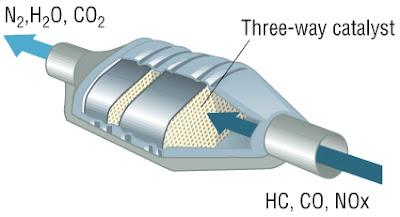
Let's put this in context.  There are 17 million cars in California.  Each one has a catalytic converter to clean the exhaust fumes to reduce pollution.  We, the people of the US, mandated this even though it costs us all extra money for a car.  We did this because pollution kills people (us) and other living things.
Catalytic Converter mandated on all cars in US
Converts Carbon Monoxide (poisonous) and oxides of Nitrogen (poisonous)
Into Nitrogen and Water (harmless) and CO2 (main Greenhouse Gas)
Replacement converters cost $400 to $1500 each for any car built after 1981 (not counting labor).  Taking the minimum $400 parts cost times 17M cars = $6.8 billion dollars.  Take the maximum of $1500 and it is $25 billion dollars.  We are willing to spend that additional $7B to $25B in California alone ($100B to $400B for 269 million cars in the USA) for cleaner cars.  (Actually more, because there are other expensive engine modifications needed, but let's keep it simple.)  To do otherwise is suicidal.  Same thing with renewable energy.  Spend the money, put in storage to smooth the peaks and valleys and be done with it.

Solar + Batteries = Match Made in Heaven
It must happen anyway because we need to get to zero GHG emissions - not a little fewer emissions, not a lot fewer, Zero Emissions.

There are other ways to flatten the duck curve such as demand management, and changing time of day pricing to change behavior, but ultimately storage is needed.  In fact there has been a need for storage for many years because of variable loads as everyone turns on the TV at the same time to look at the "big game" or has all the kitchen electric things going for Sunday dinner.
Microwave, blender, oven, mixer, toaster oven, refrigerator, ice maker, dishwasher, followed by TV, computer, clothes washer and dryer = duck's head
Utilities have been coping with peaks in mid-day with what are called "peaker" natural gas plants. Peaker plants are idle most of the day waiting for peaks in usage.  During those peaks they ramp up and run only for that short peak during the day.  Power from these plants is very, very expensive (and is billed accordingly) because you have to build a plant which will only see a few hours use a day, and you need to pay people to sit around waiting for the order to bring it online at peak times.
Peaker plant next to a solar plant.
One of them ain't gonna be there in 10 years.
https://www.greentechmedia.com/articles/read/dueling-charts-of-the-day-peaker-plants-vs-green-power
"Peaker" plants have been around for many, many years and are gradually being displaced by batteries which require fewer people and don't burn fossil fuels.  By 2020, experts say there will be no more peaker plants left.  The money currently being spent on running and building "peaker" plants can be spent on batteries instead and it will be cheaper.

Solar + storage is already a little cheaper than "Peaker" plants.
By 2023 they will be a LOT cheaper.
Why wait?
More here: https://electrek.co/2017/12/13/solar-batteries-to-take-10gw-natural-gas/

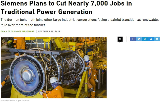
And in fact, both Siemens and GE laid off 7,000 and 12,000 workers respectively in their power businesses within a month of each other because of renewables and storage taking away business.

https://www.bloomberg.com/news/articles/2017-12-07/ge-is-said-to-plan-12-000-job-cuts-as-new-ceo-revamps-power-unit
“Renewables are putting other forms of power generation under increasing pressure,” Siemens management board member Lisa Davis told Reuters. 

In a call to reporters, Janina Kugel, another board member, put it in starker terms: “The market is burning to the ground.”

https://www.greentechmedia.com/articles/read/siemens-layoffs-renewables-traditional-power-generation

I could go on (and on and on...) but this is already too long so...